Speculative Fiction Wins Two Best Cover Awards
Just wanted to announce that TWO speculative fiction books won the ECPA BEST COVER AWARD! The Evangelical Christian Publishers Association (ECPA) announces the winners at its annual meeting.
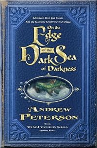
First up is Andrew Peterson’s book “On the Edge of the Dark Sea of Darkness“, which won the award for a mid-sized publisher.

WaterBrook/Multnomah published the book. The cover was designed by Mark D. Ford, Sr. Art Director, and illustrated by Justin Gerard of Portland Studios.
Way to go, Andrew! Couldn’t have happened to a more deserving author and musician! BTW – I encourage everyone to visit Andrew’s “Rabbit Room” website where he and a bunch of other authors and musicians blog. Great site!
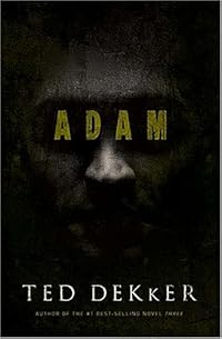
Next up is Ted Dekker’s spooky book, “Adam“, which won the large publisher category. Now some may argue this is a thriller and not speculative fiction, and they may be right. But Ted has a penchant for the spiritual battle, and I’m guessing here that this book at least edges into the speculative fiction/paranormal realm.

Thomas Nelson published this book. The cover was designed by Tim Green, The DesignWorks Group and Mark Ross, Art Director.
I wrote a post about an interview with Ted Dekker that I encourage everyone to read.
Also, my thanks go to Sally Stuart for blogging about these awards!

Thanks for the kind words, Robert. And congratulations to Mark and Justin for their hard work on the cover and illustrations. Back to work on book two…
The cover for Andrew Peterson’s book truly deserves an award. It’s beautiful.
And speaking of beautiful, Your website is wonderful! This is my first visit here, and it really captured my attention in the most pleasant way as soon as I saw it. I love the design.
Andrew, thanks for stopping by! When I post about an author, I rarely expect him to visit, much less the same day! Congrats again, and I’ll be waiting for that book two!
Cathi, thanks for your comments about my blog. I have fun with the graphics, but sometimes think its overmuch, and that maybe the white text on black is hard to read, so that’s good to know!